
Want to know the secret ingredient that can burn your bottom line—before customers take a sip, or bite? It’s design! Poor design can be a recipe for disaster.
Design Basics
Some key restaurant and bar design elements include lighting, music, layout, bathroom fixtures, and flooring. These visual statements and subtle touches give a space ambiance and its design theme.
3 Fails & Fixes
Here are three major design fails and their fixes from two food and beverage veterans—Gin Braverman, creative director at Houston’s Gin Design Group, and Jared Haibon, owner/designer of Audrey’s Coffee House and Lounge in Rhode Island. Both previously worked as bartenders, waiters or managers. In the words of Braverman, “There’s a synergy where the design and food play off each other”.
- A Memorable Theme
Fail: Your restaurant has no identity, or sends a muddled message.
Fix: Your logo, menu and décor should tell the same story.
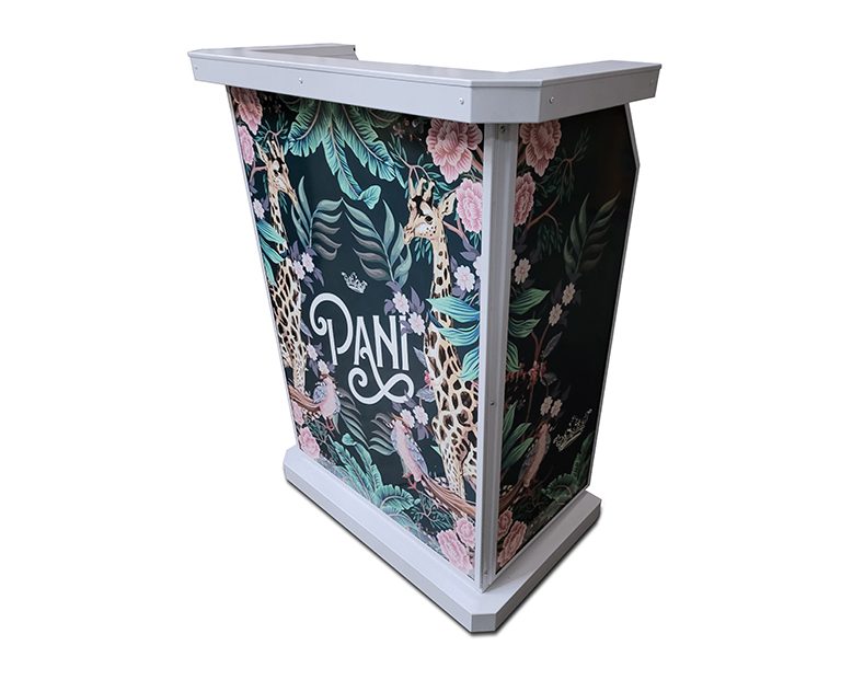
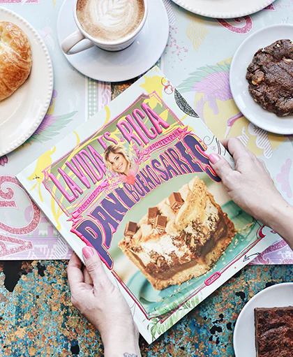
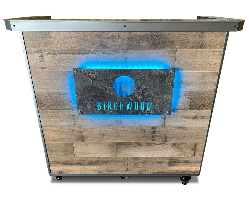
“Starting with a mission statement can help you keep consistent,” advises Braverman. At Haibon’s coffee shop, the vibe is cozy. Leather-tufted sofas, a stone fireplace, faux brick wall, tapestry, velvet chairs, and custom mugs radiate a homey feel. “Even if people come to grab a coffee to go, we want them to feel compelled to stay and have a hot apple cider in front of the fireplace,” says Haibon. Every element, including your hostess station, should reflect your venue’s theme. Our hostess stations make it easy with 100s of interchangeable laminate panel options. Rustic, modern… they suit any vibe.
- Visual Drama
Fail: Boring white plates and decor.
Fix: Instagram-worthy vignettes.
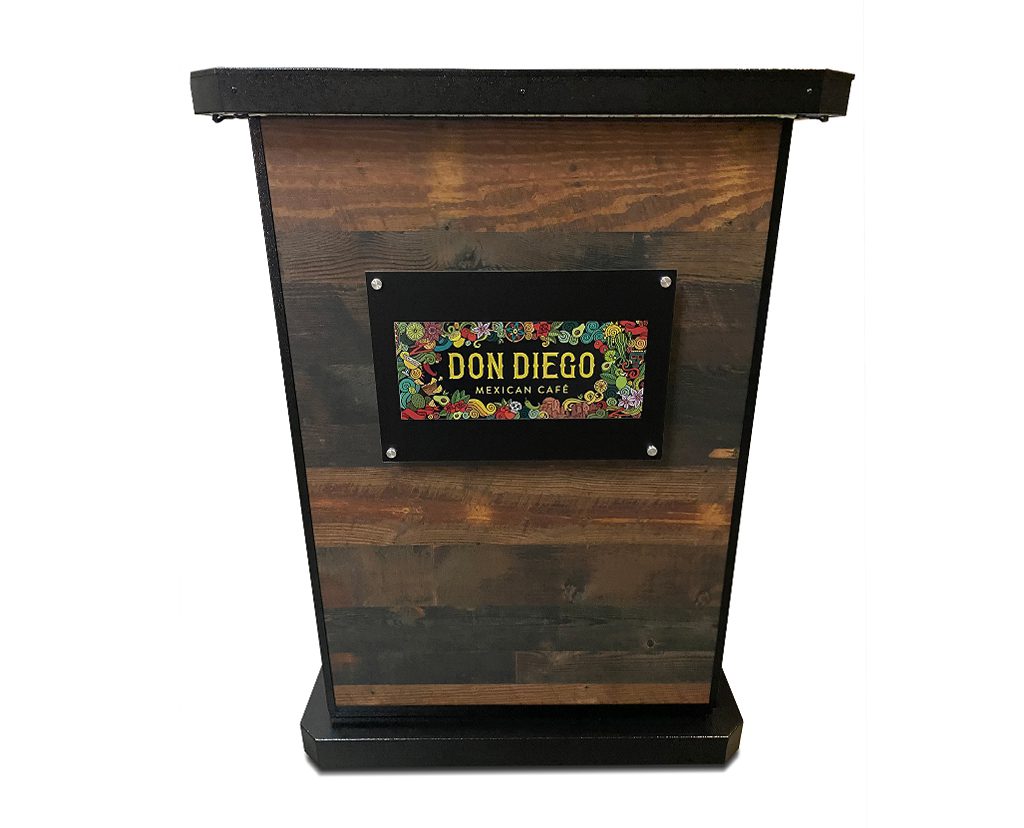
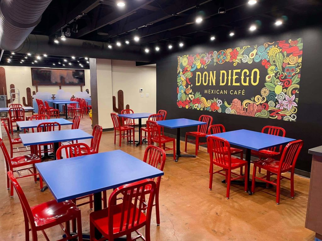
From plates to walls, add visual drama to entice customers to post on their social media feeds. Think of every wall as a potential backdrop. Haibon recommends creating vignettes within your space. For example, Audrey’s hired local artist Abbie Cates to create a mural with their logo that nods to Rhode Island (an anchor). “People love taking pictures there, which is great marketing for us,” he says. Transform one of our hostess stands into an Instagram vignette with branded signage that echoes the season or any theme you chose.
- Pleasing Hues
Fail: Haphazard use of hues.
Fix: Thoughtfully chosen colors that set the right mood.
The Haibons painted Audrey’s walls in neutrals and used furnishings to add warm, welcoming pops of color. One area has royal-blue velvet sofas, another red velvet chairs, and a third burnt-sienna, tufted leather sofas by the fireplace. Make customers feel comfortable and welcome with the right palette. Every bit of color counts, even small touches—like an inviting vase of vibrant flowers or twinkling white string lights adorning your hostess stand.
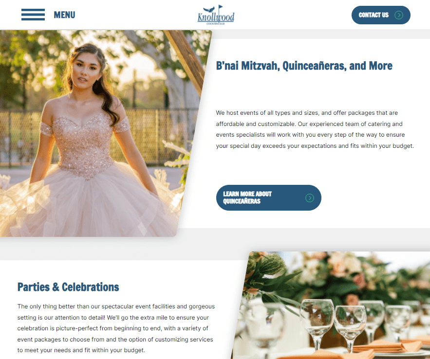
Knollwood Country Club website
More Secrets to SuccessSubscribe to our newsletter for more insider tips to ensure your restaurant avoids common fails and stays successful!
